Color Trends and Tendencias 2023 - 2024: Clay Pink
Clay Pink
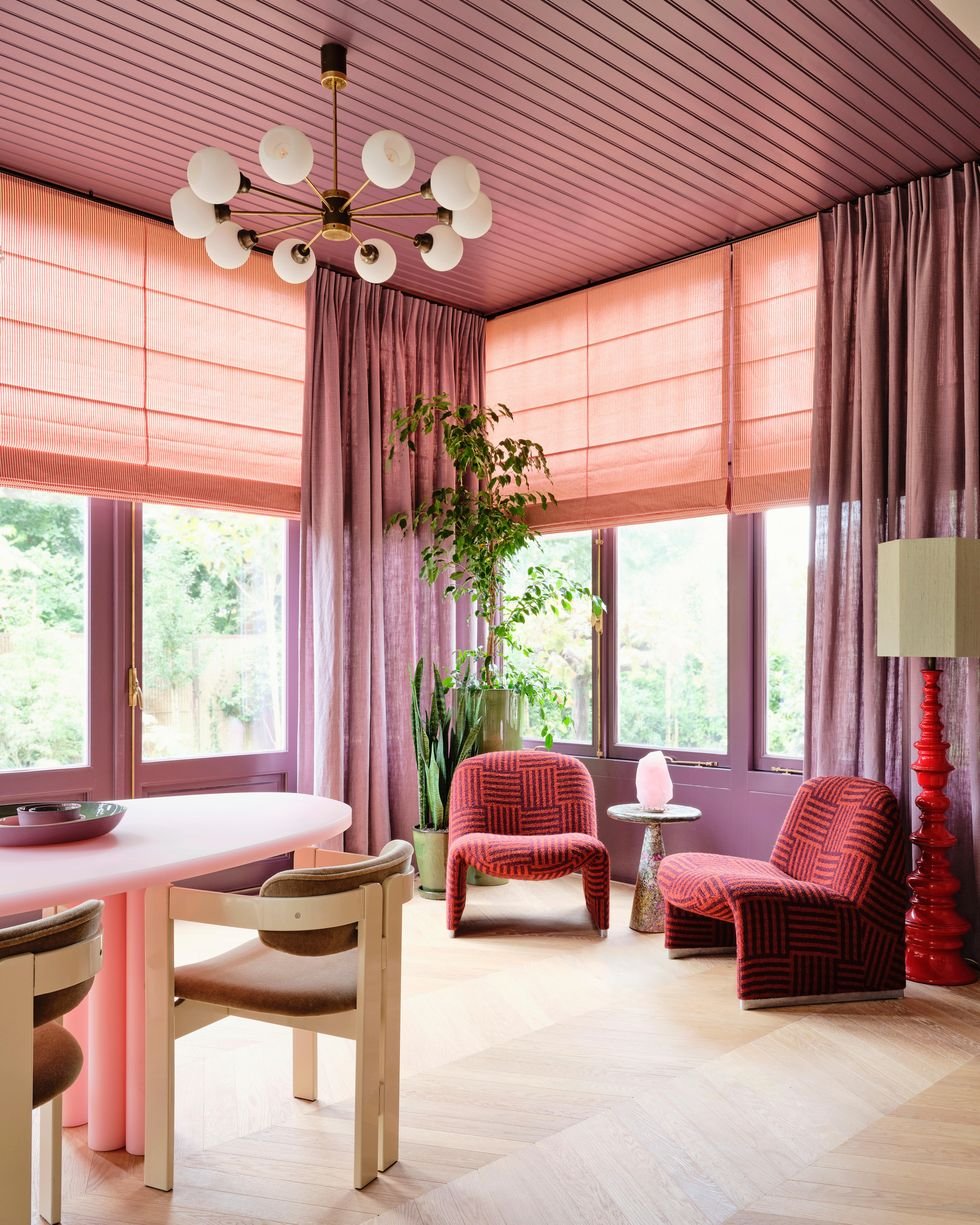
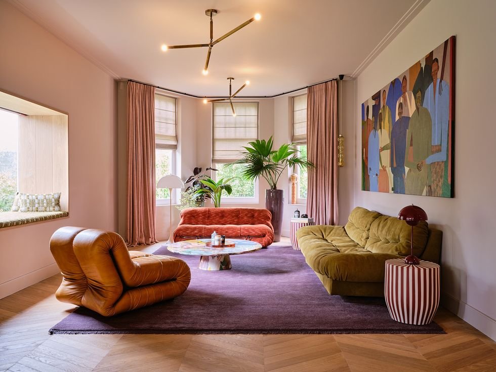
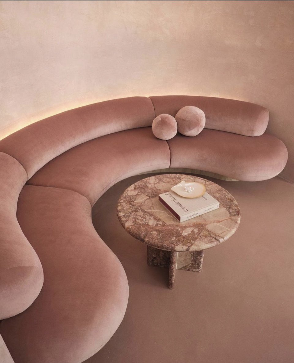
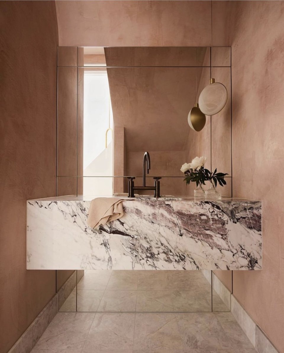
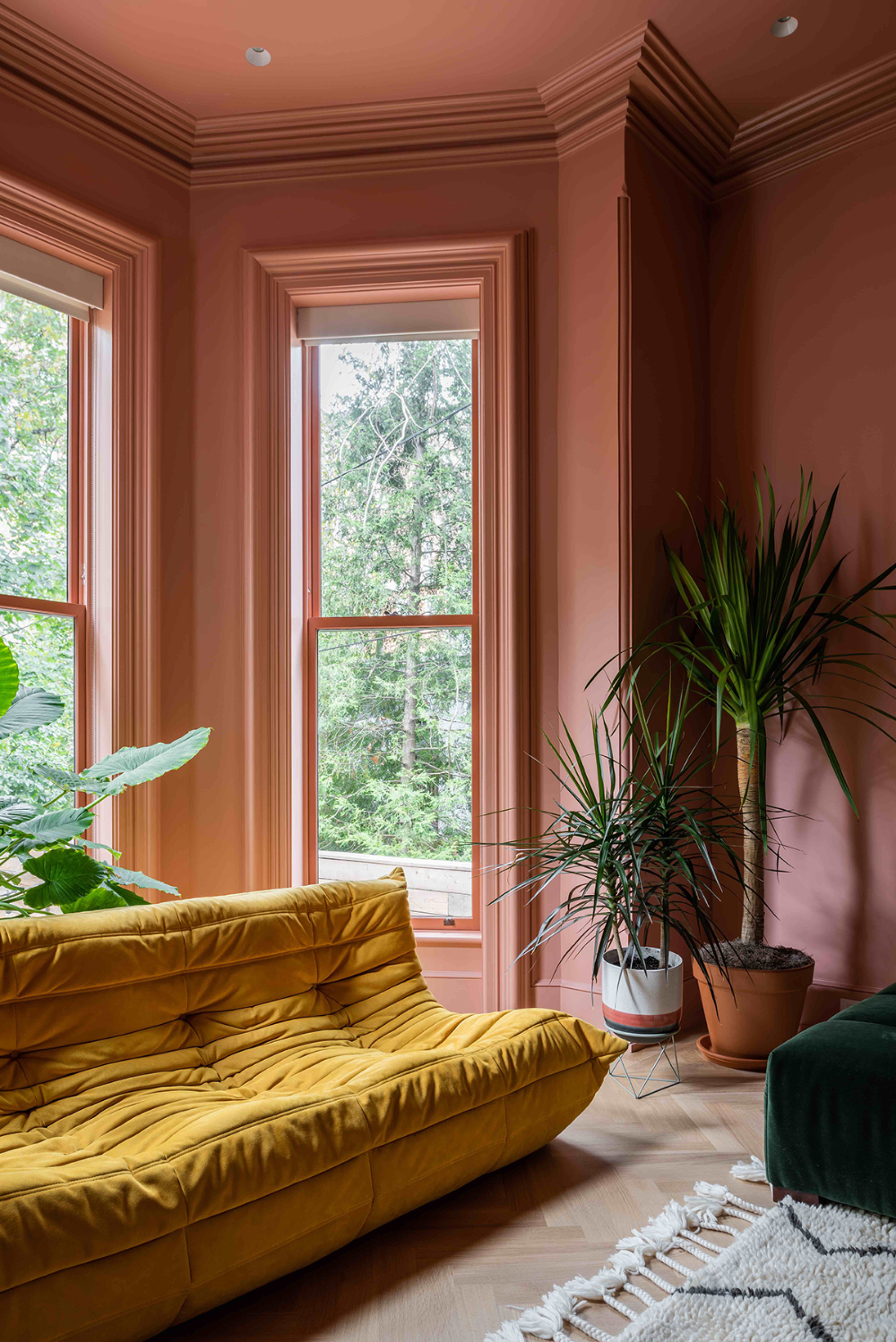
When it comes to injecting individuality and creating a warm, inviting ambience in your home, few things hold as much transformative power as color. One of the many facets of interior design that Forrest Glover Design prides itself on is the artful manipulation of color to transform and define spaces. There's an intriguing hue that has caught our attention lately, capturing the hearts of interior designers and homeowners alike: the elegant and ever-versatile Clay Pink.
We often find ourselves longing to bring a unique energy to particular areas within our homes. However, the decision of which colors to introduce and, more importantly, how to marry them together to achieve the desired aesthetic can be a daunting task. In this piece, we're diving deep into the subject of how to incorporate and pair Clay Pink, a trending shade in the interior design palette, to create chic, sophisticated spaces.
Clay Pink is a chameleon of a color that can surprise you with its impressive versatility. While traditionally perceived as more feminine and romantic, the magic lies in its adaptability. When combined appropriately, Clay Pink effortlessly infuses an elegant, clean, and organic aura into your home, making it far from being boxed into any gender stereotypes.
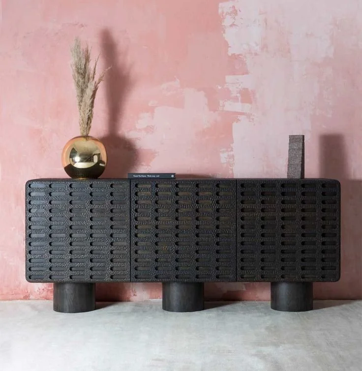
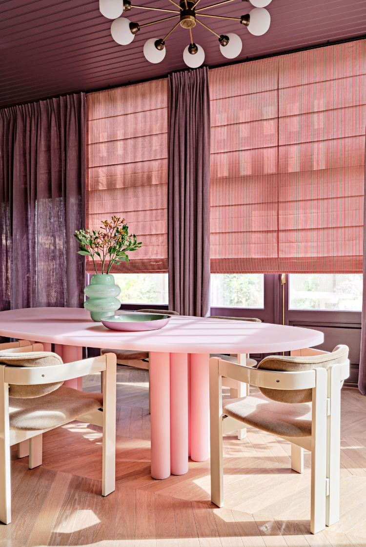
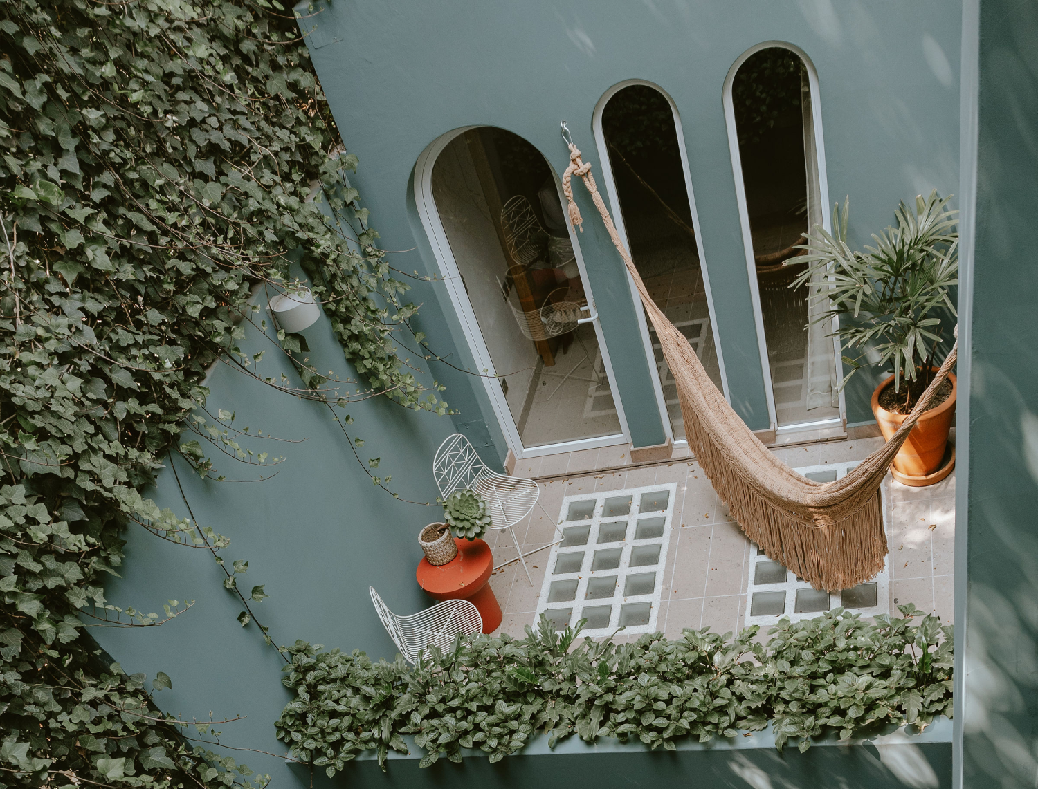
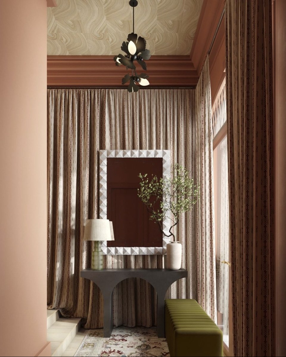
To cultivate an elegant look, consider combining Clay Pink with deeper tones such as black, charcoal, or navy blue. These darker shades provide a stunning contrast, allowing the clay pink to truly shine without overpowering the room. Similarly, Clay Pink can create a harmonious palette with deep aqua blue, resulting in a bold yet balanced aesthetic that is strikingly sophisticated.
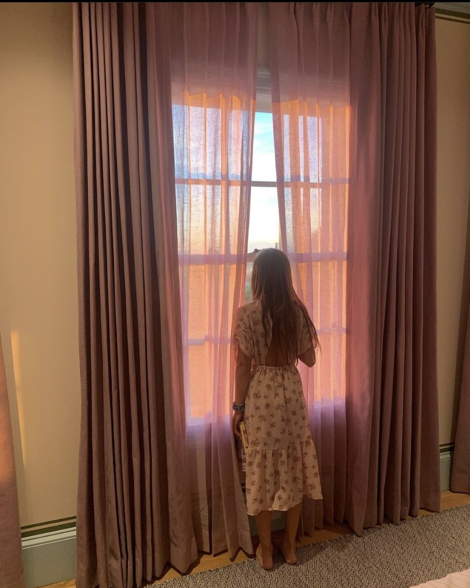
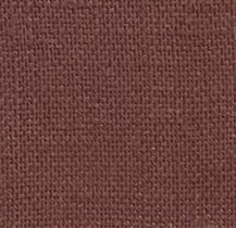
Among our collection of in-stock and special order linens, some of our favorite pairings with Clay Pink include Navy Blue, Ivory, and True Blue. And for those with a penchant for bold and adventurous color combinations, our Dusty Violet linen can create a breathtaking, unforgettable tableau when paired with Clay Pink.
Some of our favorite in stock and special order linens to combine with Clay Pink are our Navy Blue, Ivory, True Blue and if you are really daring our Dusty Violet is an amazing color to combine with pink.
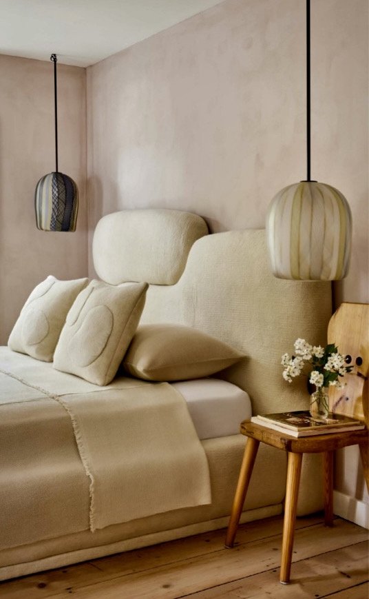
However, if your design vision steers towards creating a light, airy, and fresh atmosphere, pair Clay Pink with pristine whites or soft light greys. These color combinations create a serene and tranquil vibe that instantly calms and soothes the senses. And for the color enthusiasts who revel in a vibrant palette, don't shy away from adding pops of turquoise, purple, or gold to your Clay Pink base. These vivacious colors will bring a joyful energy to your space while keeping the Clay Pink from being overshadowed.
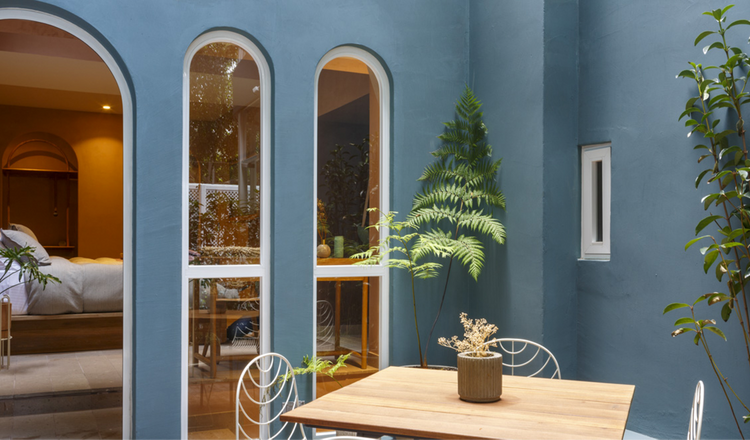
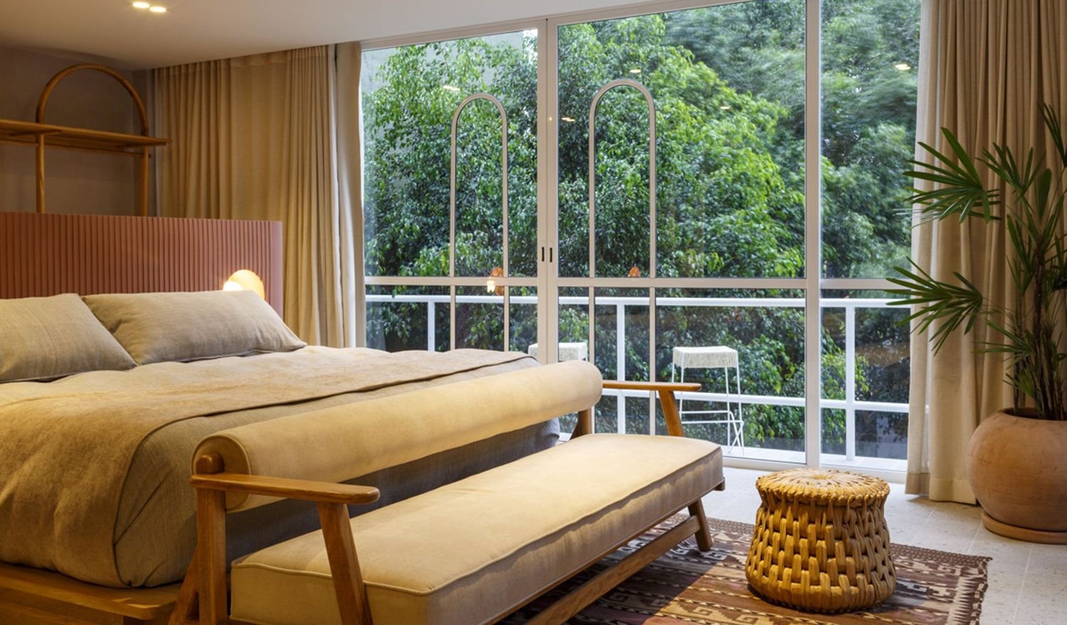
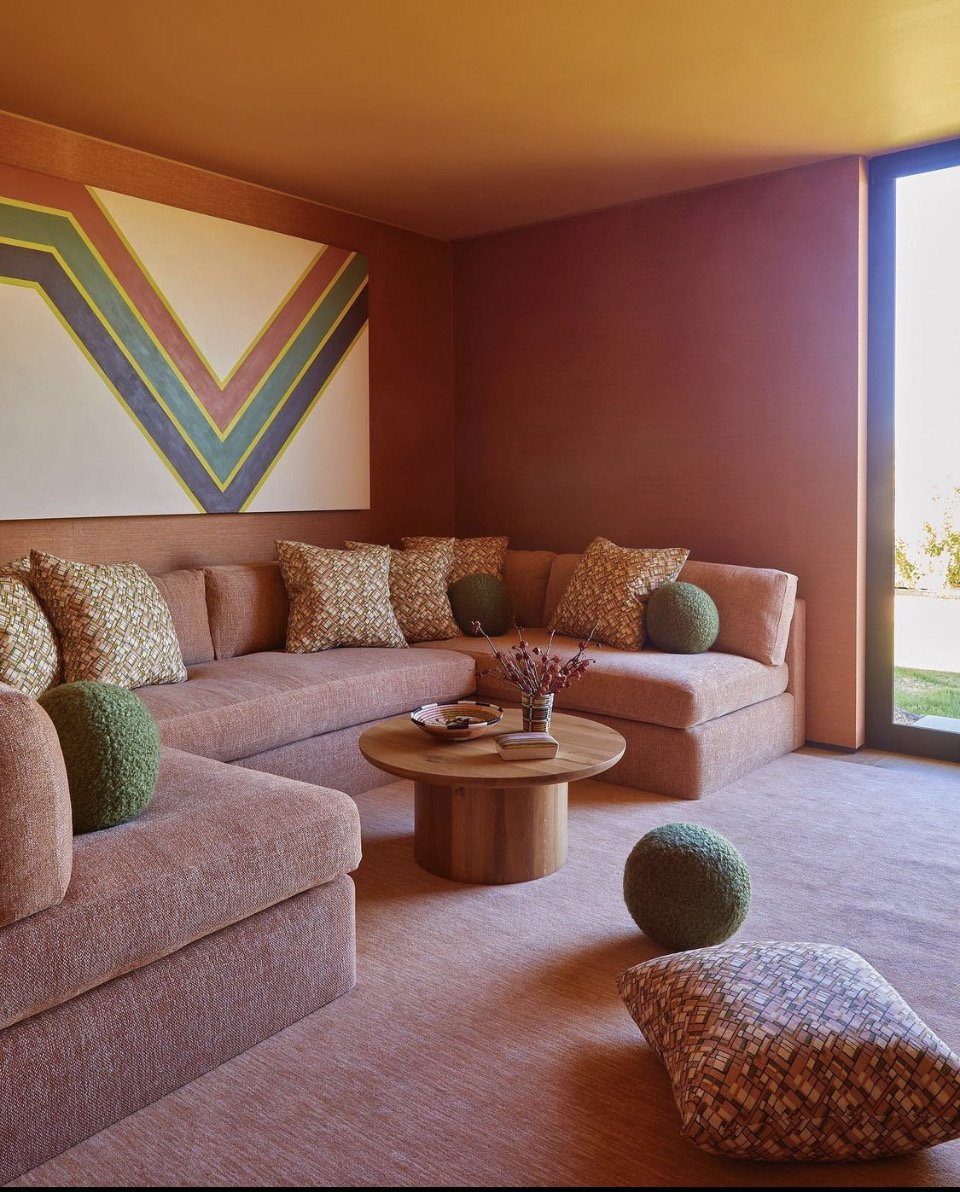
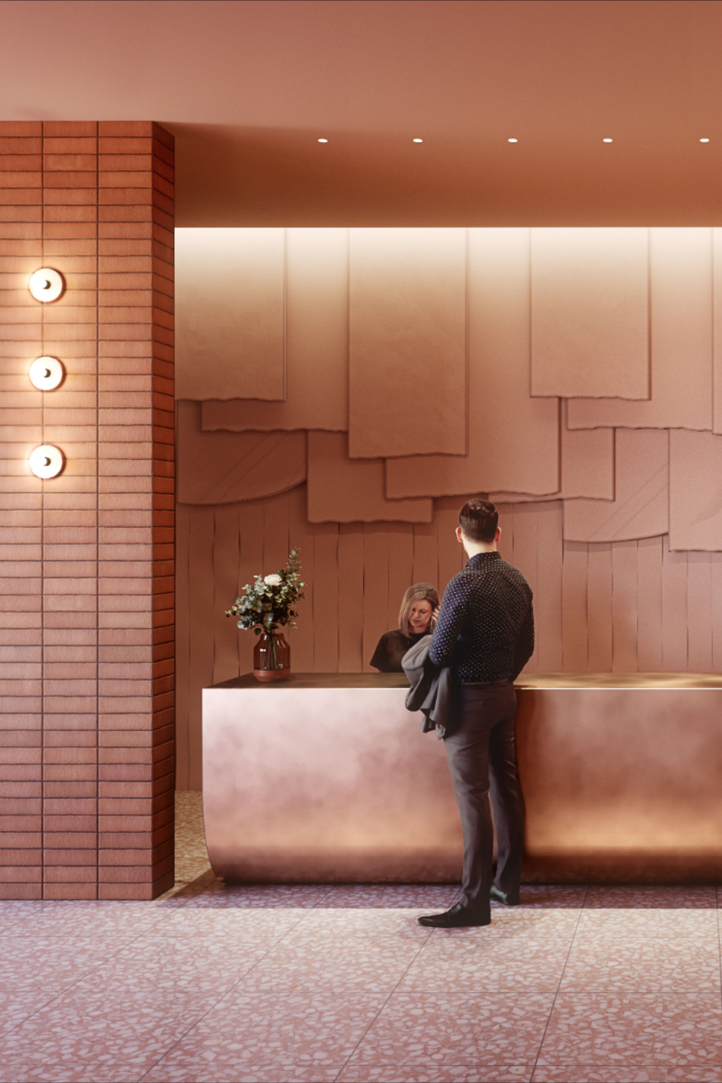
One striking example of Clay Pink’s transformative power is in the stunning Casa Uma hotel in CDMX. Every time I lay my eyes on this beautiful design, I deeply regret not having booked a stay during my visit to Mexico City for Mexico Design Week and Dia de Los Muertos from November 1 - 7th this year. Believe me, the disappointment is real!
HUGE NOTE: Although I like the design of Casa Uma, I have a horrible and shockingly scary stay after an encounter with someone they claimed was a guess and then change the story saying he was the owner. Regardless, I DO NOT recommend this hotel especially for those who aren’t seasoned CDMX visitors or residences of Mexico.
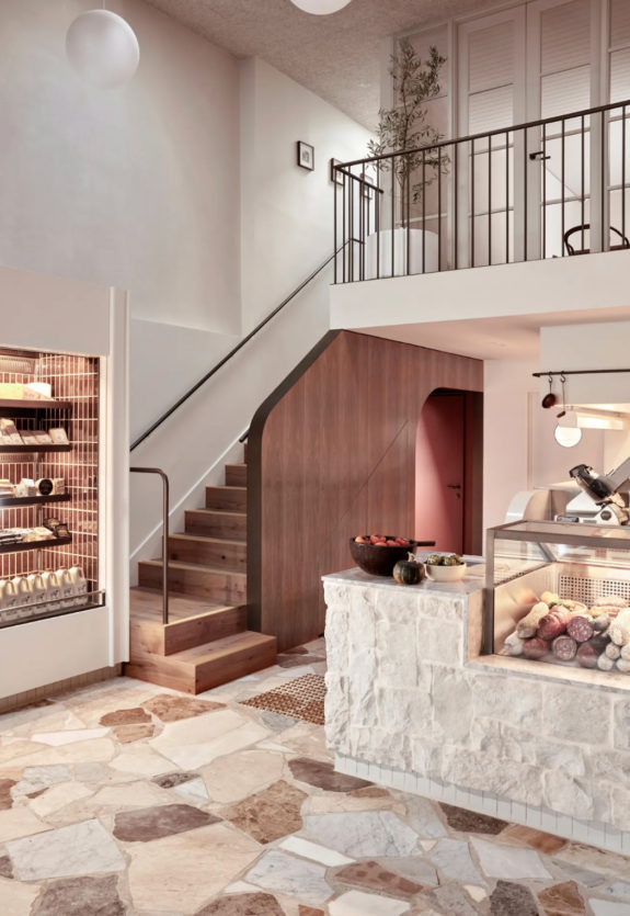
Now, let's not forget the role of furniture in achieving the perfect balance with your color schemes. Clay Pink is the perfect companion to dark wood furniture. The depth of the wood accentuates the Clay Pink, amplifying its presence, illuminating the room, and enhancing the specific area of your house you wish to highlight.
When it comes to using Clay Pink, let your imagination take flight. The color is a blank canvas waiting for you to mold it to your personal aesthetic. The fear of color should never hold you back, especially when it comes to a hue as versatile and accommodating as Clay Pink. With the right color combinations and accents, you can create spaces that resonate with your personality and elevate your home design to new levels of sophistication.
Read or original article about Baby Pink and Black Forest here.
Rosa Arcilla
Siempre queremos resaltar un lugar en especifico en nuestro hogar, pero realmente no sabemos que color poner o mas bien como poder combinar ese color. En esta sección nos enfocaremos en como utilizar o combinar el color rosa dentro de nuestro hogar.
Aunque tu no lo creas el color rosa es un tono muy versátil, y tanto hombres como mujeres lo asociamos como un color mas femenino y romántico, pero la curiosidad de este color que si sabes combinarlo puedes dar un toque elegante, sencillo y natural a tu hogar. Si en tu caso, quieres que esa recamara, sala, cocina, comedor o cualquier rincón de tu casa luzca elegante, tienes que tener en cuenta que para que esa área quede elegante, al utilizar el rosa tienes que combinarlo con colores como el negro, carbón o azul marino este tono específicamente que sea un color intenso.
Por otro lado, si quieres dar un toque mas fresco, tienes que combinarlo con tonalidades blancas, o si prefieres un tono gris claro, pero si eres ese tipo de persona que quieres estar rodeada de colores vivos puedes añadir colores turquesa, morados o dorados.
Este color queda perfecto si lo acompañas con muebles de madera oscura ya que acentúa aun mas el color, dándole amplitud, iluminación y realza esa zona de tu hogar. No tengas miedo en utilizar el rosa, deja volar tu imaginación y lograrás tu objetivo.

