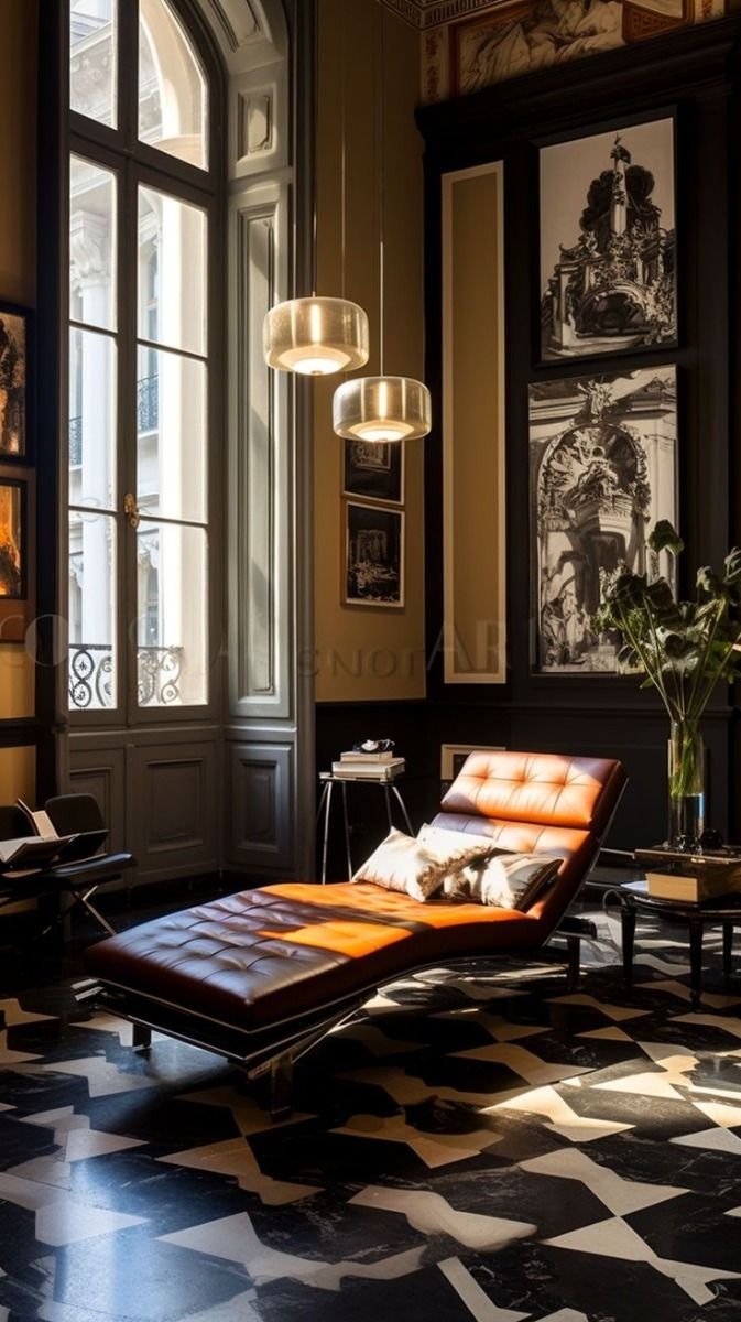
🟠 CITRUS ACCENTS
Mandarin, Saffron, Acid Lime, Meyer Lemon
Zingy and slightly irreverent, citrus shades are being used as micro-punctuations of energy. These aren’t full-room colors — they’re for powder room sinks, velvet piping, kitchen hardware, or an accent stool in a sultry living room. Think color as espresso shot.


🟡 BUTTER TONES
Pale Butter, Blonde Wood, Yellowed Linen, Faded Gold
A softer evolution of the mustard trend. These tones feel warm, nostalgic, and work beautifully with browns, rusts, and smoky greys. Less “pop of yellow,” more sunlight diffused through old lace.

🟤 WARM BROWNS
Burnt Caramel, Espresso, Dusty Cocoa, Wood Ash
After years of gray-beige domination, real brown is back. And it’s rich. Used on cabinetry, velvets, and walls, these tones ground a room and feel emotionally warm, especially when paired with brass or blush tones.
🔴 MOODY REDS
Bordeaux, Poppy, Faded Rust, Berry Red
These are reds with stories. They're less lipstick, more dried rose petal or old theatre curtain. Used with restraint, they create intimacy and a touch of drama. Picture velvet banquettes or high-gloss tile.
🔵 SOFT NAVY & AIRY BLUES
Chalky Denim, Desaturated Sky, Dusted Indigo, Blue Smoke
Blue softens in 2026 — leaning into mood and memory. Still versatile, but more painterly. These tones work as neutrals, especially when paired with stone, plaster, and wood.

🟢 COOL GREENS
Celadon, Seafoam, Minted Sage, Algae Wash
These hues feel like a deep exhale. Often paired with warm neutrals or natural textures like rattan, clay, or cane. Used in bathrooms, kitchens, and upholstery — refreshing but not sterile.
⚫ SOFT BLACKS
Inkwell, Black Clay, Charcoal Fog
Black doesn’t go away — it gets nuanced. Less harsh, more matte, and often paired with texture (bouclé, limewash, suede). It's the new neutral for minimalist maximalists.


🪨 STONE NEUTRALS
Travertine Beige, Concrete Grey, Washed Limestone, Dusty Clay
This is the architectural palette — pulled straight from the earth. It supports bolder colors beautifully or holds a room with zero color at all. Honed finishes only. Shiny is banned.
💫 ACCENT SURPRISES
Petrol Blue, Sour Plum, Electric Coral, Bronze Green
Used sparingly, these show up in ceramic lighting, dining chairs, powder room tile, or lacquered cabinetry. Unexpected, magnetic, and often a design decision that says “I know exactly what I’m doing.”